Comment
Description
You can insert comments into your UX component to document your component.
Components can be inserted at two levels:
individual controls
comment control
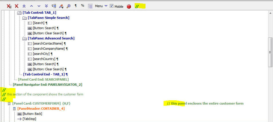
To add a comment to any control in the list of selected controls, click the comment icon on the toolbar at the top of the list. The comment icon is shown with a yellow highlight in the image below. This will open an editor where you can enter your comment.
You can either create a plain text comment, or you can use HTML to create richly formatted comments. The comment shows up on the right edge of the control list. For example in the image below, the [Panel Card CUSTOMERFORM] control has a comment. You must set the width of the UX builder to be wide enough to see the comment.
The indent level of the comments is set to 6 inches by default, but you can control this value by going to the Properties pane, Advanced section in the UX builder. You can also turn off comment display if you want by going to the Properties pane, Advanced section.
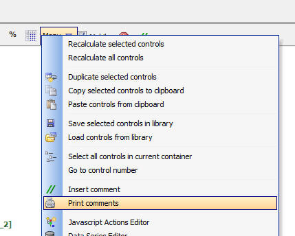
The comment control is a new control type. You can insert a comment control by selecting it from the 'Other Controls' section in the control toolbox on the left edge of the UX builder. As a shortcut for inserting a comment control, you can select the 'Insert comment' menu from the drop down menu. See the 'Menu' button in the toolbar on the image below. To edit the comment for a comment control you can either click on the comment icon on the toolbar, or you can double click on the control in the control list. In the image below three comment controls are shown directly above the [Panel Card: CUSTOMERFORM] control.
Printing Comments
You can print all of the comments in a uX component by selecting the 'Print comments' command on the dropdown menu.
See Also